Get a Mobile Optimized Website on Site123
If some stranger came up to you in 2000 saying that he would meet you in 2010 with a rectangular gadget the size of your hand with a screen on it that would allow you to see and talk to someone in China in real time – would you believe him? Probably not. Yet, in 2010 there they were, the smartphones, permeating the lives of many people and making history by revolutionizing how people would access the internet and communicate to each other.
Since then, there have been many models and versions of smartphones. Each with their differentiators, but all trying to accomplish basically the same – offer the best functionalities for the user to communicate and have most of what they need at the palm of their hands. And now, it’s about time you optimize your website for mobile so you can turn visitors into customers.
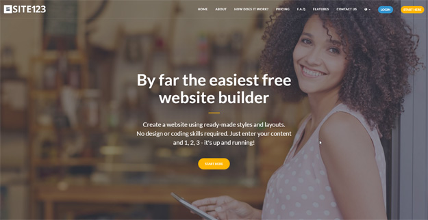
CREATE A WEBSITE
How do you make a website and optimize it for mobile devices? Go to SITE123.com and click on “START HERE”. It will open a signup page where you type in your name, email and password or even better: register with your Facebook or Google account. After that, you will be able to choose the category of website you want to create. In the next step, you will have to enter some basic information about your website. This will be used to fill in some of the template and serve of registering purposes.
TWEAK YOUR DESIGN
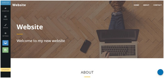
After completing the information about your business, the system takes you to the website builder. There you will find your basic template. SITE123 is a free website builder so you don’t need to purchase your template. You can change how you would like the layout as well as the colors and any other design aspects. It is very simple and intuitive. You will also find many functionalities by clicking on “Pages” and then “Add new page”. That is the place to go to add a store, videos and pretty much everything you will need on your website.
Remember – the sizes of devices got smaller and so did the copywriting. Make sure you have short interesting copywriting on your website instead of long boring ones. This way it will suit better and provide the visitor a better experience.
VISUALIZE THE MOBILE VERSION
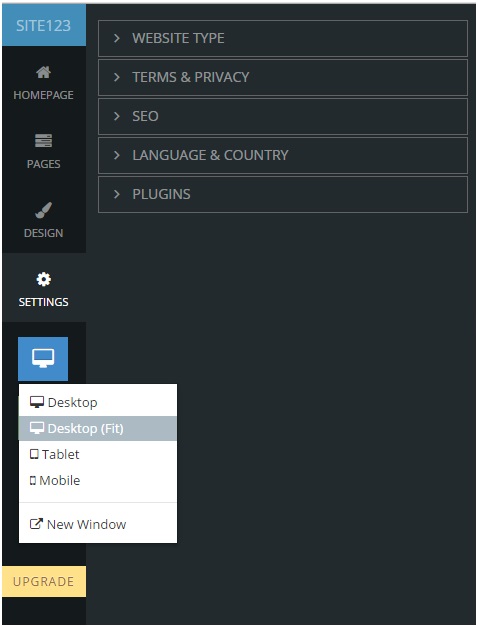
On the left side menu, you can click on the blue button to preview the mobile version of your website. Check if everything is in place and if the copywriting fits well. Look for anything that needs to be changed – images, text, pages. You may need to make some adaptions to make sure your website looks good on both the mobile and desktop versions of it. If any changes are needed, work on them until you are satisfied.
WRAP IT UP
Make any other important changes before you publish. Double check your contact information to make sure your customers can reach you. Furthermore, there are many useful SEO tools on SITE123. Make sure you go through all of them on “Settings”. Also check each of the pages’ SEO preferences by clicking on the little settings button on each page module. That will help you improve your SEO and make sure you rank higher on Google.
Subscribe & Get E-Mail Updates Delivered
Our informative Design related articles featuring the latest Resources for Web Designers & the Web get delivered via email dialy. Thousands of readers have signed up already. Why don't you subscribe as well, and get articles delivered to your inbox?
Related Posts
-
Best Tools for Cross-Platform App Development in 2019
-

How AI Can Analyse the Fraud Detection in Credit Card
-

How the Pharma Industry Can Reduce Errors With Tech
-

Website Design Tips for Small Business Websites
-

How to Set Up a Productive Home Office in Your Arizona Home for 2023
-
Beautiful Free UI Kits for Web Designers
Leave a Reply