Responsive CSS Frameworks for Developers
The purpose of a framework is to provide a common structure or foundation, so that developers are not required to create it from the ground up – and can re-use the code provided within being able to use it in a continuous manner by which to keep building websites . In this way, a framework allows designers / developers to eliminate much of the work and save time.
There are basically 2 types of Frameworks : Back-end and Front-end (this distinction is drawn depending on whether the framework is for the presentation layer or the application/ logical layer. ) Therefore, it’s important in realizing that frameworks are a conceptual notion: a pre-prepared standard kit from which to work with.
In an age of Responsive Design, choosing the right framework is not only beneficial to how your web design will display across all browsers and hand held devices- but a well-built CSS framework or boilerplate will end up streamlining your design process, as well as save a great amount of development time and ensure your website scales properly on all devices. However- with the myriad of Frameworks available, it can become a difficult choice in being able to determine which will work best and tailored to your specific requirements.
The important factor to take into consideration when making a decision as to which Framework you want to go with is: whether you require a grid, and if whether it will it be fluid or fixed? Secondly, consider the level of customization you will require? Thirdly – how much precedence do you give regarding semantics? And lastly : what is the level of support and documentation which is available concerning the chosen Framework?
This post details 25 Responsive CSS Frameworks & Grids to help you make that decision.
1. Foundation
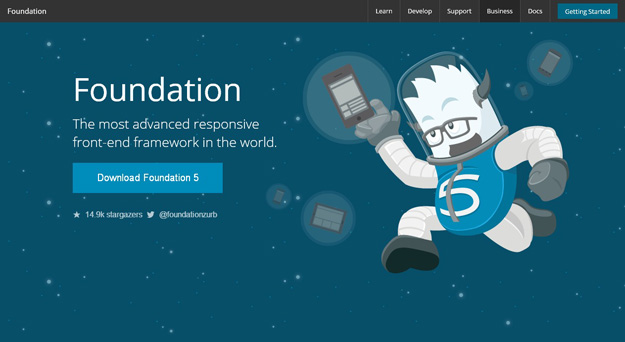
Foundation5 from Zurb is most popular framework amongst front end developers, it is built with Sass, a powerful CSS preprocessor, which allows us to much more quickly develop Foundation itself and gives you new tools to quickly customize and build on top of Foundation. hey have built a new command line tool that will let you spin up Foundation projects preposterously fast, and those projects will now use Libsass, a back-end Sass compiling library that will dramatically speed up how long it takes for your SCSS changes by 5x.
2. Bootstrap
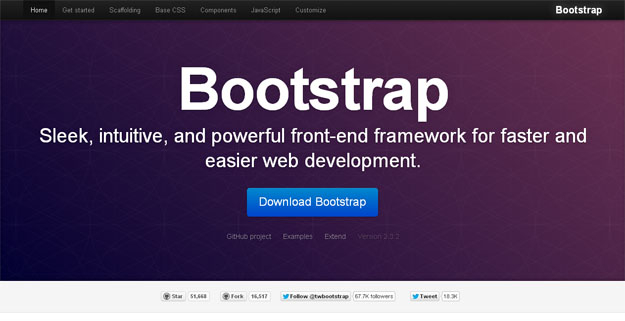
Twitter Bootstrap is a toolkit created by Twitter for kickstarting CSS when developing websites. It is built with Less and consists of base CSS + HTML for typography, forms, buttons, tables, grids, navigation, and some more. The grid provided is 940px wide 16-column and, for the layouts, there are solutions for both fixed + fluid ones.
3. Gumby
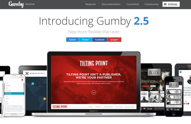
Gumby Framework is a flexible, responsive CSS Framework, Powered by SASS. Create rapid and logical page layout and app prototypes with a flexible and responsive grid system and UI kit. Gumby 2 is built with the power of Sass. Sass is a powerful CSS preprocessor which allows us to develop Gumby itself with much more speed — and gives you new tools to quickly customize and build on top of the Gumby Framework.
4. UI Kit
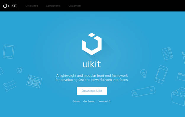
UIkit is a lightweight and modular front-end framework for developing fast and powerful web interfaces. UIkit gives you a comprehensive collection of HTML, CSS, and JS components which is simple to use, easy to customize and extendable.
5. Cardinal

The purpose of this framework is to make it easier to rapidly prototype, build, scale, and maintain CSS for responsive web applications. Cardinal omits many aesthetic design decisions often bog down larger, more complicated CSS frameworks, leaving the design and creativity up to you.
Cardinal focuses on performance, accessibility, and readability first. It’s a starting point with a minimal file structure and useful CSS styles that you will want to customize and build upon to suit your application or project.
6. Pure
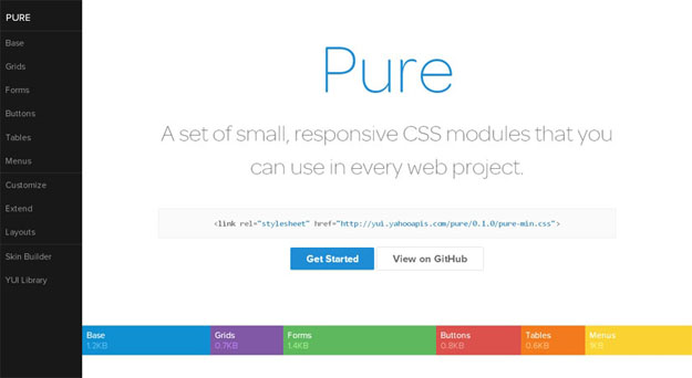
Pure is a set of small, responsive CSS modules that you can use in every web project. Pure is ridiculously tiny. The entire set of modules clocks in at 5.7KB minified and gzipped, without forgoing responsive styles, design, or ease of use. Crafted with mobile devices in mind, it was important to us to keep our file sizes small, and every line of CSS was carefully considered. If you decide to only use a subset of these modules, you’ll save even more bytes.
7. Yaml4
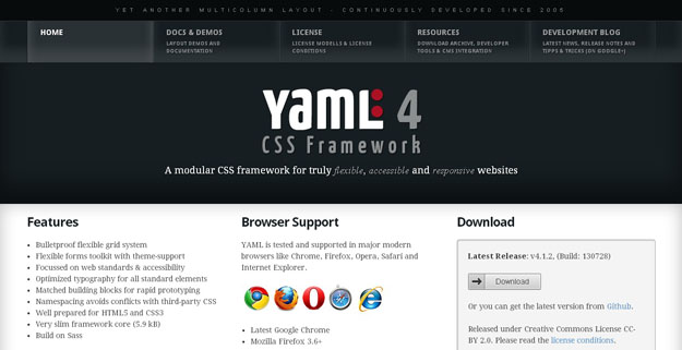
YAML is a CSS framework that is popularly known as Yet Another Multicolumn Layout. YAML provides a complete set of matched building blocks to create complex websites. Grids, navigation, forms, typography module and all provided add-ons work seamlessly together. YAML is focussed on device independent screen design and provides bullet-proof modules for flexible layouts. This is a perfect starting point and the key to truly responsive design.
8. Sculpt
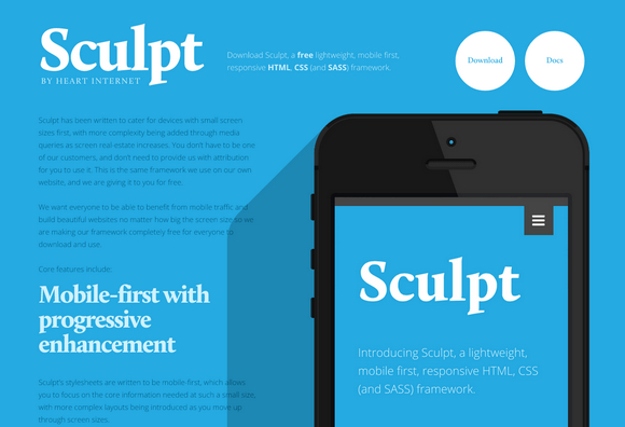
Sculpt is a lightweight, mobile first, responsive HTML, CSS and SASS framework. It has been written to cater for devices with small screen sizes first, with more complexity being added through media queries as screen real-estate increases. With three grid sizes (732px, 960px and 1140px) built in and active depending on your device’s screen size you can be sure your content will be well presented no matter the conditions.
9. Layer CSS
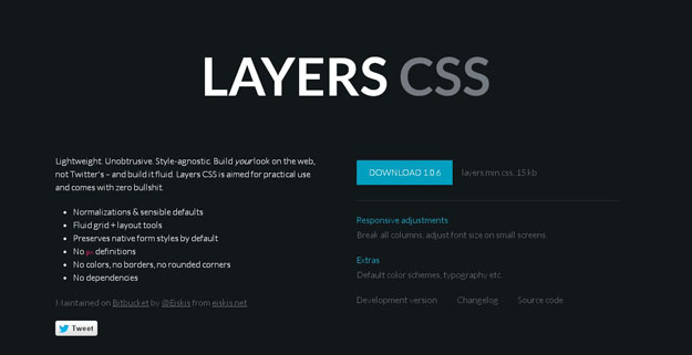
Layers CSS is a lightweight CSS framework that doesn’t emphasize any designs but handles the main structure. It has support for responsive layouts with fluid grids and simple classes are used for dealing with them. There are styles for forms, tables, lists and more but no colors or rounded-corners, customization is totally up to you. Layers also comes with handy “everyday-use-styles” for clear, floats or hiding.
10. Markup
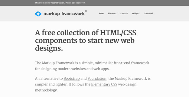
The Markup Framework is a simple, minimalist front-end framework for designing modern websites and web apps. An alternative to Bootstrap and Foundation, the Markup Framework is simpler and lighter. It follows the Elementary CSS web design methodology.
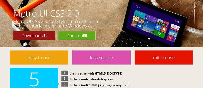
11. Metro UI
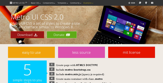
Metro UI CSS is a set of styles for creating such interfaces. It is a self-contained solution but can also be used side-by-side with any other frameworks. There are styles for the popular tiles, images, notices, forms, buttons and typography. The framework is also a “work in progress” and is mentioned to be enriched with more layout options + features.
12. Less Framework
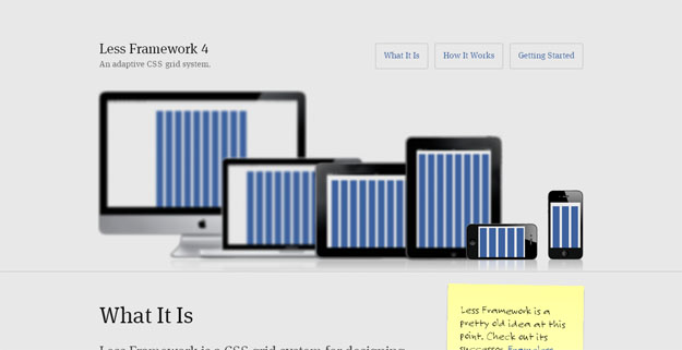
Less Framework is a lightweight CSS framework that enables you to build flexible multi-column website layouts. It contains an eight-column grid optimized for a line-height of 24px & a set of typography presets based on the golden ratio which is parallel to the grid’s vertical rhythm.
13. Fitgrd
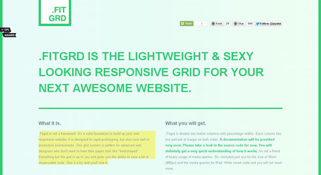
Fitgrd is not a framework. It’s a solid foundation to build up your own responsive website. It is designed for rapid prototyping, but also runs well in production environments. This grid system is perfect for advanced web designers who don’t want to have their pages look like “bootstraped”. Everything but the grid is up to you and gives you the ability to save a lot of dispensable code.
14. Gridism

Gridism is a simple responsive grid that’s easy to use. On screens smaller than 568px wide, grid units are stacked, while on larger screens grids can have a maximum width of either 978px or 1140px.
15. Rocket CSS
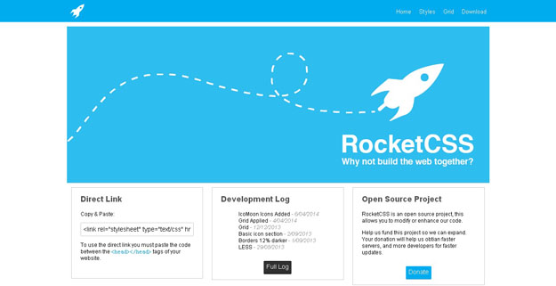
RocketCSS is a very simple, responsive and easy to use CSS framework. This framework includes almost everything from websites buttons to website icons and, lets you make your website visually exciting and compel visitors to stay and interact.
16. Fluidity
Fluidity is a tiny bit of CSS (107 bytes total) that fixes the part of HTML that isn’t completely responsive. It makes changes to the way images, tables, iframes, preformatted text, and canvas elements, so that they’re completely responsive.
17. Kube
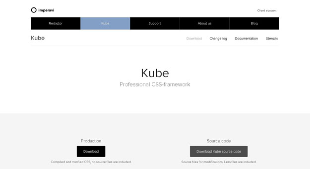
The Kube Framework is not an overblown responsive CSS framework with multiple layouts and styles, all you have with Kube is a single CSS file. That is were its beauty lies – in its simplicity. The framework also supplies LESS files for the gurus out there who enjoy preprocessing.
18. SkelJS
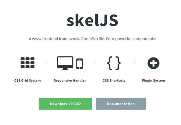
skelJS is a lightweight frontend framework for building responsive sites and apps. Consisting of only a single JS file (weighing in at just 18kb as of this version), it gives designers and developers access to four powerful components: CSS Grid System, Responsive Handler, CSS Shortcuts and Plugin System.
19. Cascade
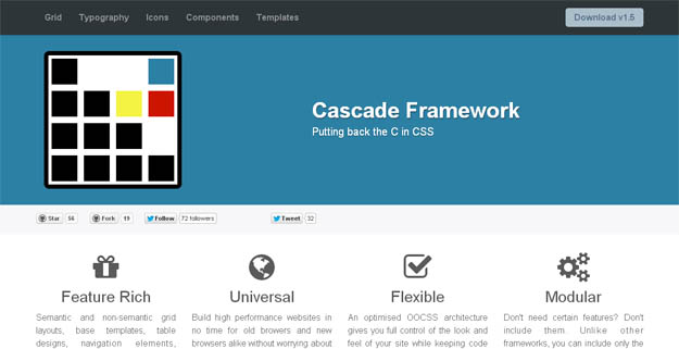
Although the overall look and feel of Cascade Framework mostly inspired by Twitter Bootstrap, Cascade framework is not just another Bootstrap clone. Where Twitter Bootstrap puts its focus on delivering shiny user elements that can be dropped into any project and takes control of your project’s overall look-and-feel, Cascade Framework is intended to do the opposite. By splitting your CSS into separate files based on features rather than selectors as well as by implementing a modifier design pattern inspired by SMACCS and OOCSS, Cascade Framework puts you in control!
20. Golden Grid System
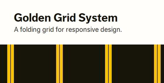
Golden grid is a web grid system that is totally focused on grid-based designs (not a complete CSS framework). Golden Grid uses float:left approach for building grids rather than positions. It is a 6/12 column grid system with a 970px main width.
21.Base
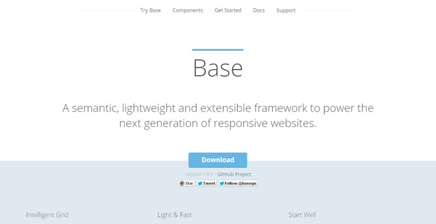
Base is a semantic, lightweight and extensible framework that allows you to create fluid and fixed grids with your own widths, columns, gutters, offsets and padding. Built on beautiful, configurable LESS CSS engineered around a set of variables and mixins. Base is ready to transform into any site you throw at it.
22. 960 Grid
A CSS framework that is better known for helping you to organize your work flow as far as your website development is concerned is none other than the 960GS framework. Most importantly, the 960GS framework is known for offering you two diverse packages of twelve as well as sixteen columns that can either be used on its own or in accordance with one another.
23. 52 Framework
52framework is a CSS framework which provides an easy way to build websites using HTML5 & CSS3 while still supporting all modern browsers (including ie6). It uses HTML5 tags like header, nav, section, article, footer or new input field types like url, email, etc. The framework also has a HTML5 compatible reset stylesheet.
24. Grid Forms
An effort to make beautiful forms for web applications that make data entry less painful. Grid forms is a front-end library which handles the boiler plate necessary to build grid based forms.
Grid forms are dense forms designed for use in applications that require lots of data to be entered regularly. It’s a tiny Javascript/CSS framework that helps you make forms on grids with ease.
25. Groundwork CSS

A Responsive HTML5, CSS and Javascript Framework that lets you create scalable, accessible web applications that work on virtually anything.
Subscribe & Get E-Mail Updates Delivered
Our informative Design related articles featuring the latest Resources for Web Designers & the Web get delivered via email dialy. Thousands of readers have signed up already. Why don't you subscribe as well, and get articles delivered to your inbox?
Design addicted Geek who harbors a passion for Web Design & Technology.
Related Posts
-
What possibilities do PSD to HTML Conversion bring in the Web Development?
-
Best Tools that Might Enhance the Efficiency of Research Students
-
Responsive jQuery Image Sliders for Developers
-

20 Best jQuery Plugins for 2014
-

A Complete Guide to the Best Messenger Marketing Platform
-

Best Mathematical Study Tools for University Students
Leave a Reply