How To Make Your Ecommerce Web Design More Effective

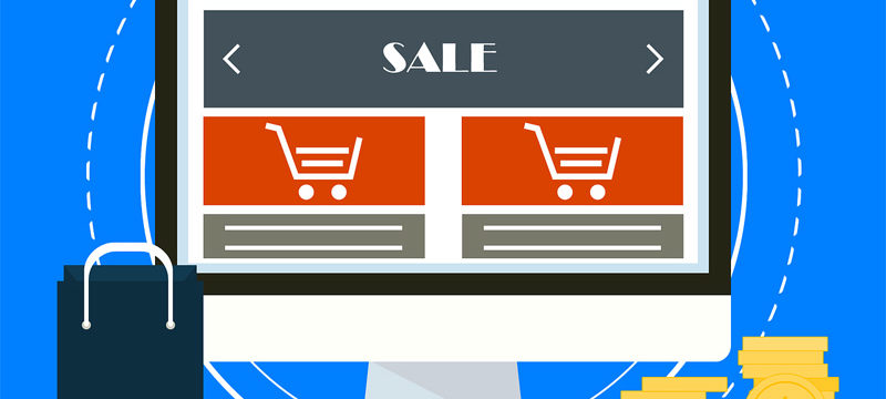
There is a big role to be played by the ecommerce web design services companies. Nowadays, you cannot think of doing business without having the option of doing online selling. Many people prefer this method to the conventional method of visiting the retail stores. Life has become fast and people opt for this mode due to paucity of time. This is why the ecommerce website has a major contribution to your business. What you require is the services of a reliable and proven ecommerce website design agency. The ecommerce design must be developed in such a manner so as to generate as much of online business as possible. Here are a few tips for you to make your ecommerce web design more effective, classy and fruitful. Let’s explore the article below.
Use larger and bolder images:
You need to catch the eyes of the users. This is possible with the use of the larger images. This is the fastest way of catching the attention of the viewers. The top ecommerce web design agencies can effectively use the images for immediate communication. The images also make the designing process simpler. The images should have some bold element in them. They should be different from the traditional type photographs. Only then, will they be able to stand out from other sites. You must check the photo usage competence of the ecommerce website builder agency first before you award the job.
Long scrolling methods:
There are both method of long scrolling and short scrolling used. It is seen that the long ones are showing greater popularity among the users. They feel more comfortable using the longer scrolls. There are lesser chances of this trend losing popularity soon. When these longer versions are used, there is an impression that the web pages look minimal. It increases the interest among the users. The ecommerce web designers will be successful in engaging a larger number of visitors. This will turn out to be a very result-oriented measure taken by the designers.
Divide into sections:
Dividing into sections on the same page will make the reader read the content easily. In some websites, you may find several hyperlinks that prompt you to move to the page after. This is a deterrent to hassle-free readability. You have to remove the content which is not meaningful. A trimmer and shorter section of contents will increase the interest levels among the readers. Long and monotonous paragraphs tend to put airway the reader. Break down into smaller bullet points also if you want to increase readability.
Make use of an explainer:
This is also one of the modern trends. The implementation of explainers is effective in raising the interest levels of the readers. Try to incorporate elements such as videos that are explanatory in nature. This builds up a system of communication. The readers feel the urge to know more about the service or the product. In this manner, you can get larger conversions. The chances of your business rise. The explainers are one of the best ways to make an impression on the minds of the reader. Most of the ecommerce contents nowadays are making the inclusion of the explainers.
Use lively colors:
The lively color usage will attract more people to your ecommerce pages. These are more true for the mobiles. The expert designers know how to use the best color combinations to create eye-catchy ecommerce pages. The content should be comprised of vibrant colors with text matter that has clear readability. Use the proper combinations so that the text matter stands out from the designs. The reader should feel comfortable and soothing when he looks at your ecommerce page.
Use grids of different shapes:
Different shapes of grids enhance the readability of the content matter. Important points can be highlighted with the use of these grids. If you combine them with the main matter, they may be lost out and the need to highlight will not be felt. The expert designers are aware of the methods of creating the effective grid designs for highlighting content.
Use animations:
An animated ecommerce page will show a greater flow of web traffic. Try to include catchy animations. It has been proved the animated sites can bring in better business in comparison to the ones devoid of any forms of animation. Ask your designer to include a few animations and not too many of them.
Keep the overall design simple: Do not make the design too complicated. This may put off customers. People are more comfortable in using simpler sites. Use some spaces also in the parts of the content. This adds to the visual relief Do not use too much of cramped up matter. The navigation from one page to another must be maintained as simple and easy to do.
Following the above tips can help you make your ecommerce web design more effective. See to it that these things are being followed.
Subscribe & Get E-Mail Updates Delivered
Our informative Design related articles featuring the latest Resources for Web Designers & the Web get delivered via email dialy. Thousands of readers have signed up already. Why don't you subscribe as well, and get articles delivered to your inbox?


Leave a Reply