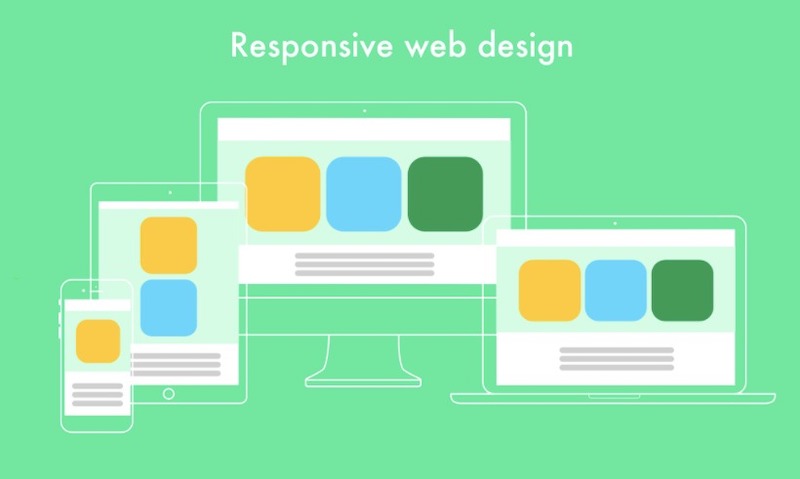
How to Create a Responsive Design and Why Choosing a Responsive Website is Better?

If you want your business to prosper, you have to attract a lot of customers. And the most effective way to do it well is the development of your app or a website. Also, you should keep in mind that your responsive site must look perfect on mobile devices due to a massive amount of customers visiting sites via smartphones, tablets, and other devices. In this article, we will show you a couple of tips and tricks on how to create a proper responsive design and give you advice about choosing a website or a mobile app.
How to design a responsive website from scratch?
Let’s begin with the basics. If you don’t know where to start, follow this simple guide.
1. Establish a period when you need to create a website
2. Take into account different technical difficulties when you are planning to make a website
3. Think over the right content for your site
4. Start designing
5. Don’t forget about typography
6. You should always remember about mobile screens
7. Test your design in various browsers
8. Development begins
Is it necessary to create a responsive design?
It always depends on your goals, needs, and resources. You need to determine your business development strategy, and leaning on it, you can choose between a responsive website or a mobile app. But to make things clear, let’s find out the benefits of mobile apps and responsive websites.
Why should you choose a mobile app?
Exclusive features and benefits from them
You can give your customers specialized features, and the mobile app is powerful enough to bring all your ideas into life. If you work out a beautiful app icon, it will remind your customers about your services and your brand.
Ease of access anytime
It’s obvious that websites can’t provide services without a constant internet connection. You can put a huge amount of functionality into your app and make it independent from the Web.
App for additional purposes
A mobile app can provide your customers with services that differ from your website. In your app, you can put the main functionality that you intended while the site can fit in the promotion of your app. There is no reason to duplicate content in both places.
Full use of device features
If you came to the conclusion that your customers are going to need access to camera or GPS navigation or other features strongly connected with phones, don’t hesitate to choose a mobile app.
Online shopping
If you are bounded with this sphere, it’s necessary to have a mobile app. It provides your customers with a smooth workflow, and all functionality of your website will be on the tip of the finger.
Reasons for selecting a responsive website
Product advertisement
Let’s pretend you came up with the idea of creating a new app. And you ran into a problem of promoting the product. It’s a perfect circumstance to create a responsive website that helps people to find out about your new brand. And if it works out well, you can start creating a mobile app. It’s a well-known practice when app owners hold a website to make their apps more popular.
Your website is content-driven
It’s unnecessary to create an app if your website specializes in sports news or cocktail recipes. The power of the site will be enough to cover all customers’ needs. But this decision relies on your audience and final goals.
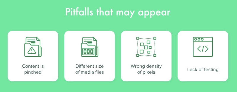
Pitfalls that should be highlighted
There are several pitfalls in responsive website development.
Content display
To make it right, developers should walk-in customers’ shoes. It is vital to understand what customers want to see when they open a website on a mobile device. Which content can be hidden and how different parts of the website will be displayed on other devices.
Size of media files
An upload speed of media files is also important. Not a single customer likes a slow loading taking too much of their time. So developers should take care of the proper size of media files.
Density of pixels
Remember the main rule: your site must look perfect both on mobile and desktop.
Testing sequence
It’s vital to test a website on a wide range of devices to make sure it works smoothly and as planned. Using different platform emulators is a must.
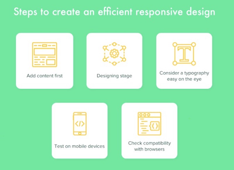
Steps to make a responsive design
Begin with content
1. All your work starts from here, so take this algorithm to make everything right.
# Give a writer a task to create content for the website.
# A designer should search for proper images leaning on content.
# The designer should also develop a sketch of all content of the site (text, buttons, and so on).
# Developers can change anything until everyone is satisfied with the result.
# Begin design sequence.
Design process
Designers start to create mockups that rely on previous content \ using pre-made templates or building it from scratch.
Typography
Designers should pay great attention to the fonts. There are many useful tools for the development of the right fonts.
Don’t forget about mobile screens
You should test your design on different mobile screens during all design stages because it’s easy to forget that you are developing for mobile devices, while on a big screen your website looks beautiful.
Take into account various browsers
Different browsers can bring some changes to the view of your site. So don’t hesitate to test your design on all possible browsers.
Development
When everyone is pleased with the final results, it’s time to begin the development of your site. Make sure you provided your developers with high-quality mockups with all website content. Also, you have to confirm all stages of the development and every feature after each sprint, so you and your team have the same vision of the final product. And if something feels out of place, feel free to say about it until it’s too late.
How much time and money does it cost?
Let’s take a look at the whole picture. Responsive web development cost is always pretty high. It’s tied with a huge variety of resources involved in the development process. The cost of the development can vary from 8000$ to 12000$ and beyond (if you want to build a complex website with a wide range of features). But the profit of such investment is high. You’ve got a website that fits all screens and will satisfy customers with all possible devices.
Subscribe & Get E-Mail Updates Delivered
Our informative Design related articles featuring the latest Resources for Web Designers & the Web get delivered via email dialy. Thousands of readers have signed up already. Why don't you subscribe as well, and get articles delivered to your inbox?
Related Posts
-
Top 10 PHP Frameworks for Web Application Development!
-

Lost Your Laptop? Here’s a Checklist of Things to Do
-
Beautiful Free UI Kits for Web Designers
-

Why Your Home Needs Fast and Reliable Internet
-

How AI Can Analyse the Fraud Detection in Credit Card
-

5 Conversion Boosting CX Tactics to Implement in 2022
Leave a Reply