Best Tools for Creating Responsive Designs

Responsive design started as a so-called fad about 3-4 years ago and it has matured into the default mode of website design and development. It is simply the most practical way for website owners to cater to the deluge of devices with different screen sizes and resolutions.
Why Responsive Design
Using this mode of design and development for a website means:
• You do not need to create different versions of your website for different devices
• You have one single codebase to maintain and update
• Your website is optimized for mobile and desktop devices at once
As it turns out, responsive design is not a new technology, but a new way to re-purpose existing CSS features in a creative way. It does require a lot more code to make a responsive design. In order to cut down development time, you need specialized tools that will automate the repetitive details and take care of the underlying technical complexities. Here are a few of the best responsive design tools available to web designers and developers today.
1. Webflow
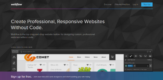
If you do not want to mess with code at all and want an easy way to make beautiful responsive sites, Webflow is just the right tool. It is a web based tool based on a drag and drop workflow. This is the best tool for non-technical website owners and you get hosting and templates to boot.
2. Adobe Edge Reflow
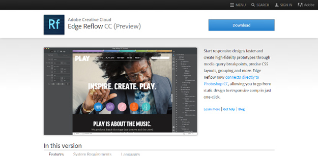
Since Apple refused to support Flash on its mobile devices, Adobe has created some of the best tools for HTML5 and CSS development. Edge Reflow is a responsive design tools that lets you create complex designs without being bogged down with pages upon pages of code staring at you.
3. Macaw
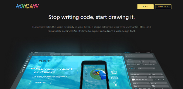
This is another new kid on the block and a very impressive one at that. With Macaw, you do not need to write a single line of code. All you need to do is draw your design on its website and it will take care of the underlying code. Probably the best thing about this responsive design tool is that it generates extremely clean HTML and CSS to implement your design into a working website.
4. Gridless
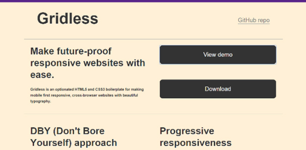
If you want to create a responsive website with beautiful typography, Gridless is currently the most promising tool available to you. This is especially useful if you are tired of grid based CSS or are just starting out with web designing and need an easy way to prototype your designs quickly.
5. Bootstrap
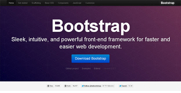
This is the most popular framework used by developers to create designs. It is grid based but also supports responsive design from the word go. It is very actively developed by the folks at Twitter and is free and open source. The default design of Bootstrap is amazing enough to get you started, and you can keep tweaking it here and there until you find a look for your site that you find best.
6. Foresighg.js
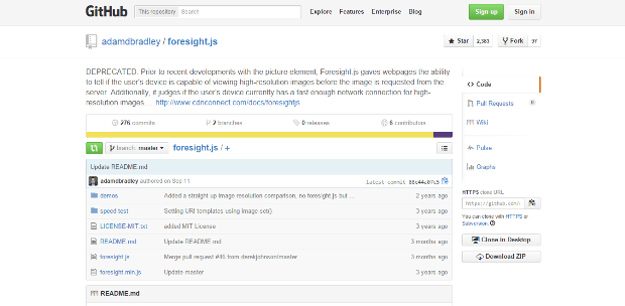
Responsive design involves a lot of code and different image sizes, which makes it a bigger download for your website visitors. Foresight.js allows you to determine the screen size and resolution of the device your visitor is using and also find out how strong their network is. It sends the most appropriate code and images to the users’ device, so they do not experience slow loading times on your website.
7. Responsive Wireframes
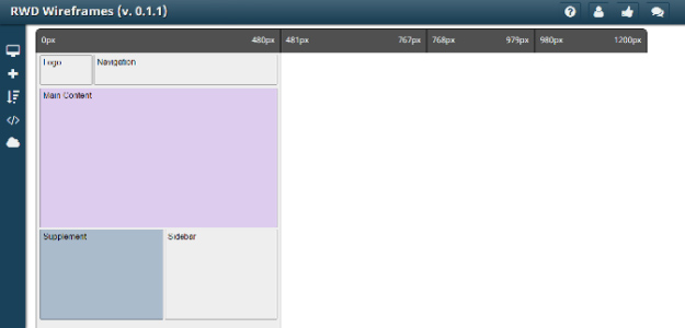
This tool allows you to see how your responsive design will look on a number of different screen sizes. It is based purely on HTML and CSS underneath, so you will get clean code. It is great for rapid prototyping. Once you have the design nailed down, you can use other tools to implement the design in a more efficient way.
Whether you like it or not, responsive design is here to stay and it is the future of web design. Yes, it can be a pain to implement it, but it offers a simple solution to a major problem of supporting a hundred different devices for developers. The above tools will help you build your responsive website much quicker. They also produce much cleaner code than if you had done all of it manually.
Subscribe & Get E-Mail Updates Delivered
Our informative Design related articles featuring the latest Resources for Web Designers & the Web get delivered via email dialy. Thousands of readers have signed up already. Why don't you subscribe as well, and get articles delivered to your inbox?


Leave a Reply